An AI image style list: 36 styles, one prompt, one image each
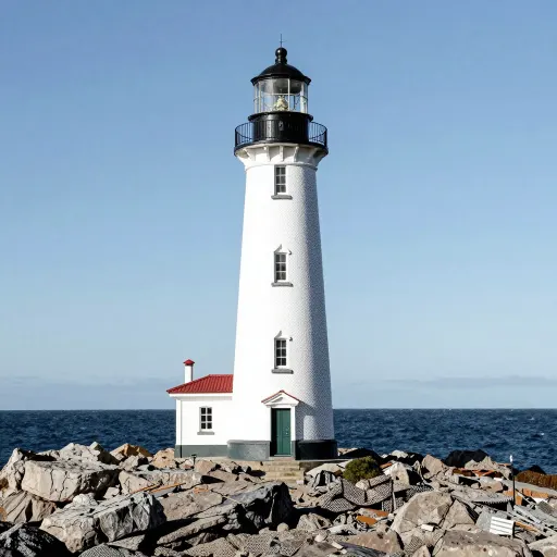
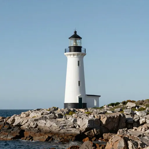
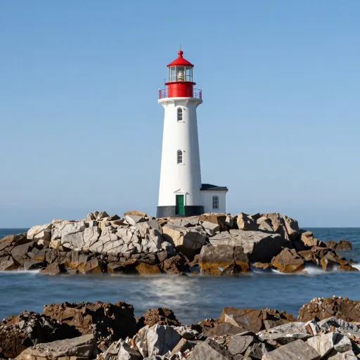
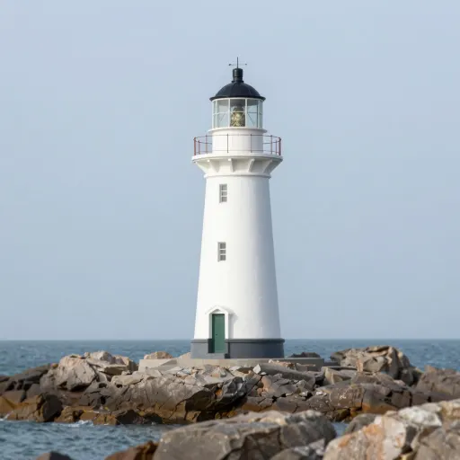
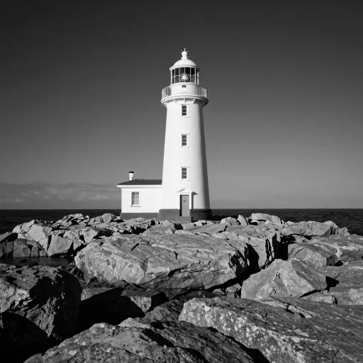
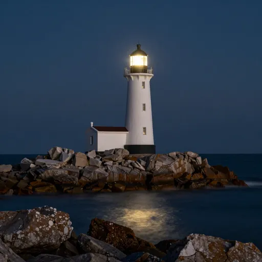
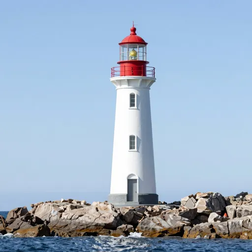
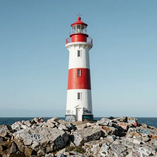
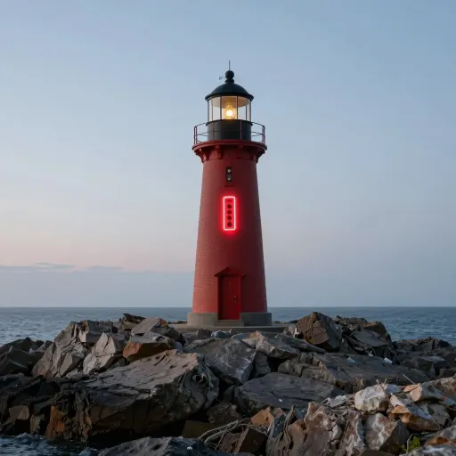
The same lighthouse rendered 36 ways, so you can see which style words the model honours and which it quietly ignores.
Prompt setprompting·FreeImgGen Team·Updated ·Tested on Z-Image Turbo
The short answer
This AI image style list runs 36 style words over one subject. Style words work when they name a physical medium and fail when they name a technique or a design school. Across 36 runs on the same subject, media like watercolour, woodblock, cross stitch and papercut arrived every time, while bauhaus, halftone, double exposure and infrared came back as ordinary photographs. A third group is stranger: ask for stained glass or origami and the model puts the object in the scene instead of drawing in that style.
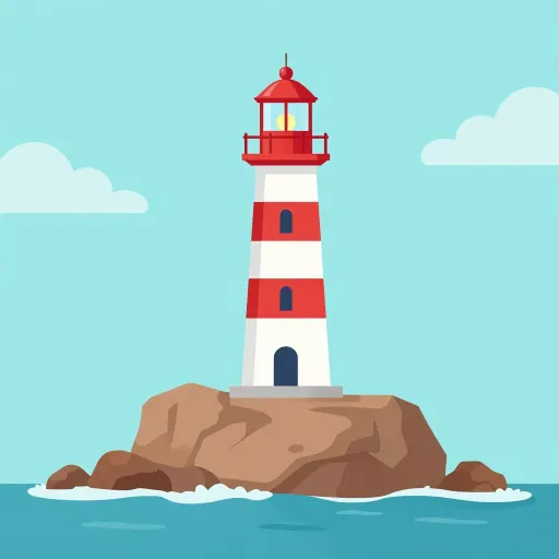
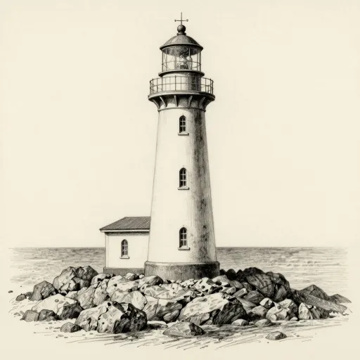
MethodOne subject, "A lighthouse on a rocky coast", with 36 style phrases appended one at a time. One generation per style, Z-Image Turbo, 2026-08-12, nothing re-rolled. Every prompt is printed under its frame so the comparison is reproducible.
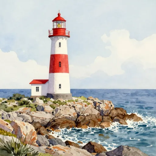
watercolour painting
A lighthouse on a rocky coast, watercolour painting
Sorting the 36 results by what actually happened gives three groups rather than the usual two.
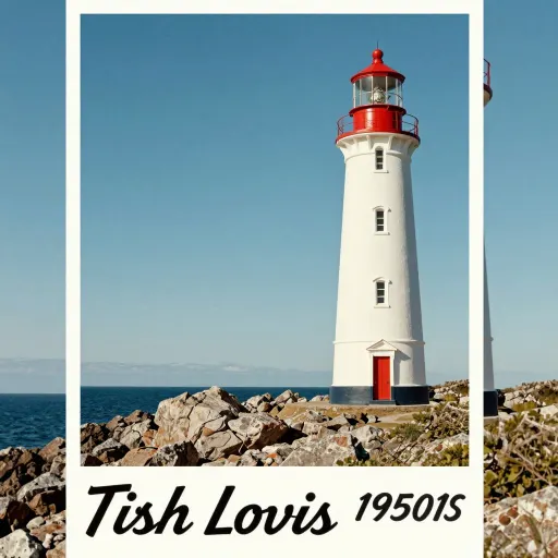
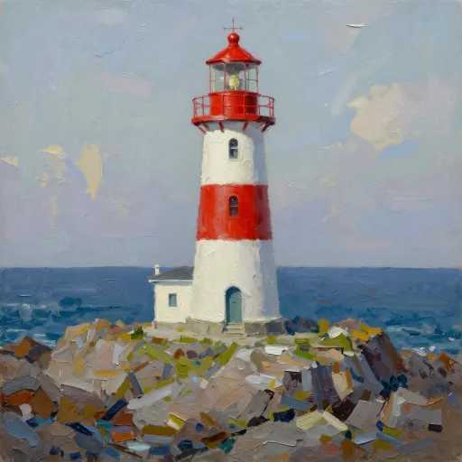
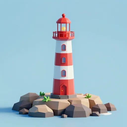
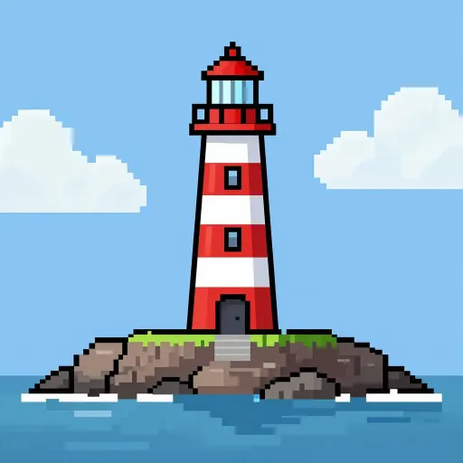
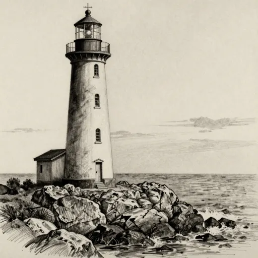
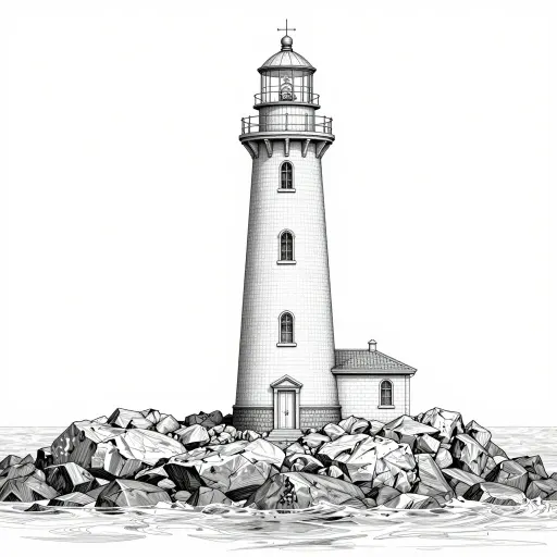
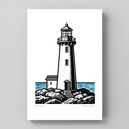
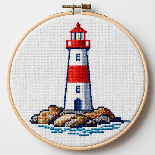
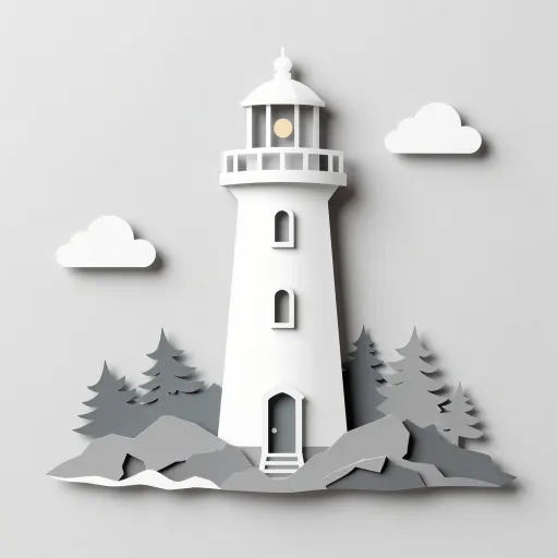
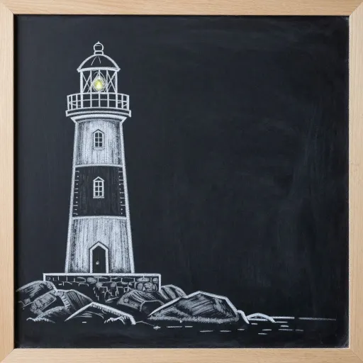
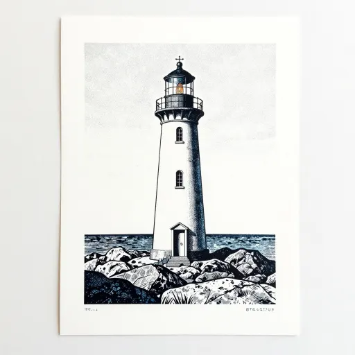
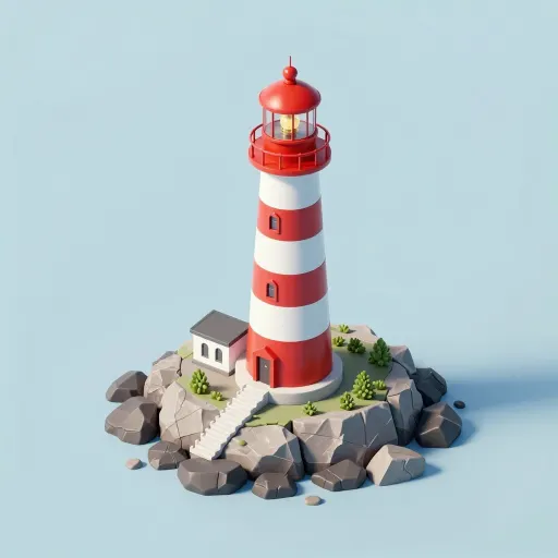
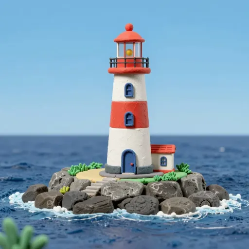
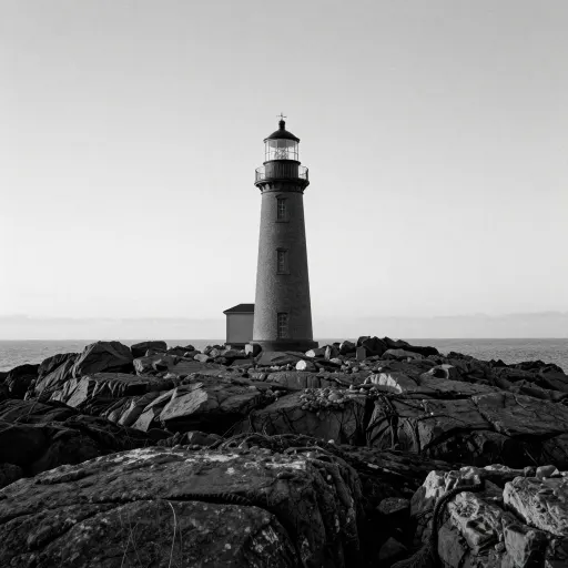
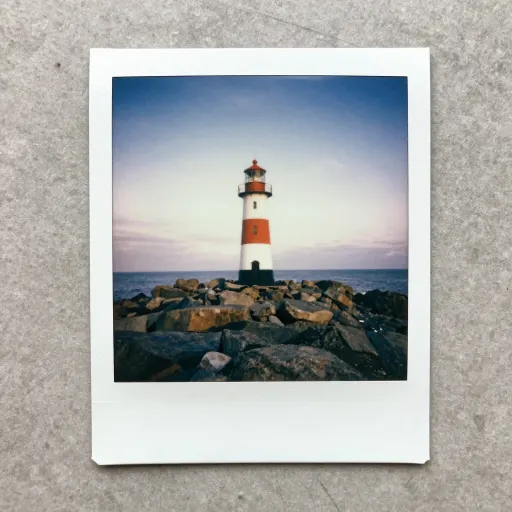
It becomes the medium. Eighteen of the 36 did this cleanly. Watercolour, oil impasto, woodblock, charcoal, pixel art, low poly, cross stitch, papercut, chalk, claymation, isometric diorama, polaroid. In every case the picture is genuinely made of the thing.
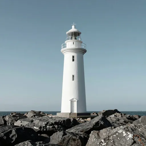
It is ignored. Seven came back as a straight photograph with no trace of the request: bauhaus geometric, comic book ink and halftone, stop motion felt, double exposure, infrared, technical cutaway, and to a lesser degree tilt shift.
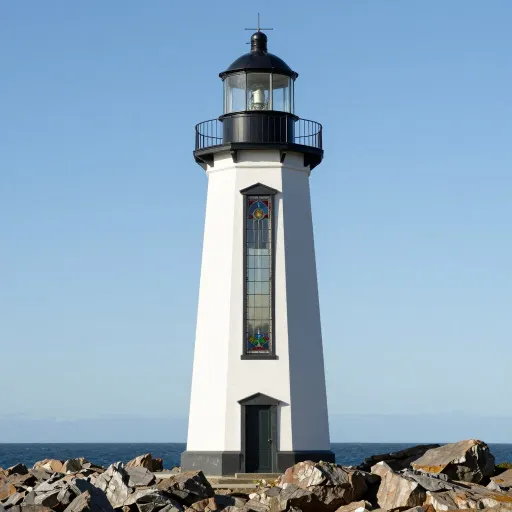
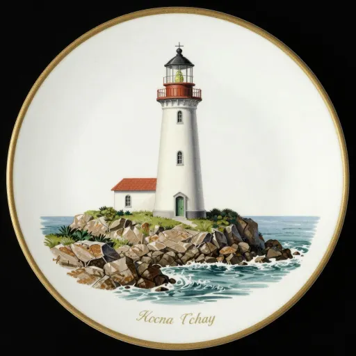
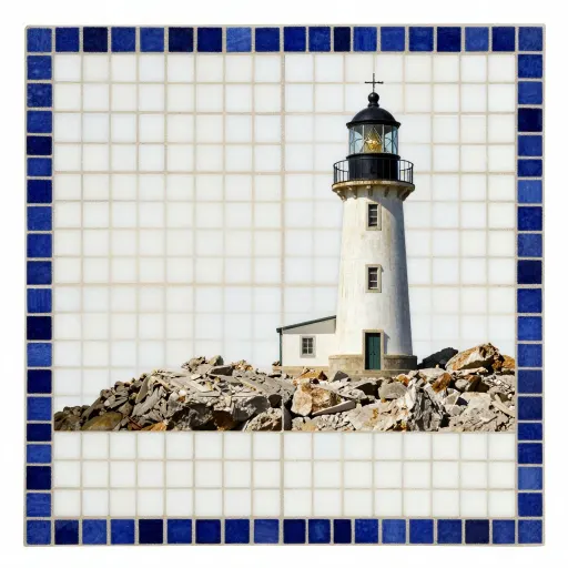
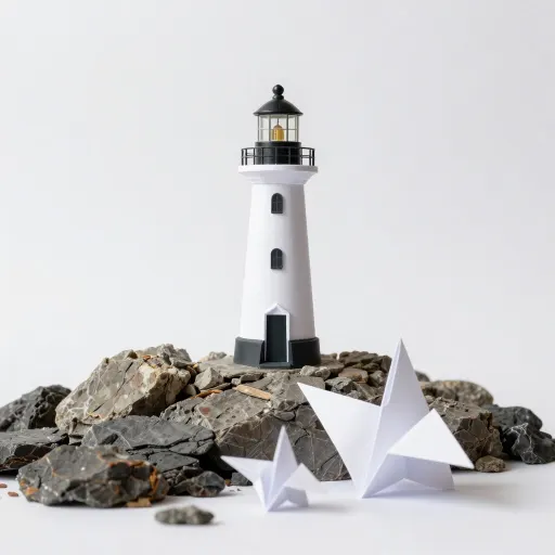
It becomes a prop. This is the one nobody warns you about. Ask for stained glass and you get a photograph of a lighthouse with a stained glass window in it. Ask for a vintage botanical plate and you get a china plate with a lighthouse painted on it. Ask for origami and you get two folded paper birds sitting on the rocks. The model parsed the style word as a noun in the scene.
Why media work and techniques do not
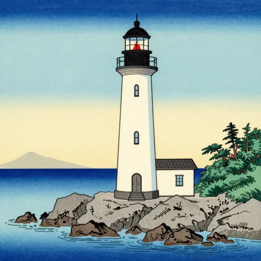
The split is not about how obscure the term is. Ukiyo-e woodblock is a narrower concept than "comic book", and the woodblock worked while the comic did not.
What separates them is whether the word describes what the picture is made of or how it was produced. A watercolour looks like a watercolour in every pixel: the paper texture, the bleed at the edges, the way pigment pools. Training captions describe those pictures as watercolours, and the visual evidence is everywhere in the frame.
Infrared, double exposure and halftone are processes. Their visual signature is subtler and, crucially, an infrared photograph is still a photograph, so the caption sits on an image that mostly looks like every other photograph. There is much less for the model to latch onto.
The practical rule: if you could tell what it was made of by touching it, the style word will probably work.
Getting the ignored ones anyway
For the seven that failed, naming the visual consequence works better than naming the process.
Infrared came back as ordinary black and white. Asking instead for "white foliage, near-black sky, glowing leaves" describes what infrared film actually does, and that is a set of conditions the model can picture, which is the same principle as one added word versus a rewrite.
Bauhaus produced nothing. "Primary colours, hard geometric shapes, no gradients, flat composition" is the same instruction in terms the model has seen labelled.
Double exposure is the hardest of the group, because it is a compositing operation rather than a look. That one is genuinely faster to do in an editor afterwards.
Ad
What every style shares: the text problem
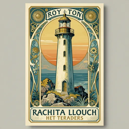
Three of the styles imply lettering, and all three produced beautiful layouts wrapped around words that are not words. The 1950s travel poster reads "Tish Lovis 19501S". The art nouveau poster offers "RACHITA LLOUCH".
This is worth knowing because poster and album-cover styles are among the most requested, and they are exactly the ones where you will need to set the type yourself afterwards. The composition the model gives you is genuinely useful. The words on it never are, at that size.
Short text in a clean, central layout is a different story, and does often come out right; there is a working example in the first-image walkthrough.
Using this as a reference
Every frame above is clickable. Clicking one loads that exact prompt into the generator, where you can swap the lighthouse for your own subject and keep the style phrase.
That is the useful shape of a style list: not 200 style names copied from another list, but a smaller set where you can see what each one actually produced before you spend the time. The 36 here were chosen to span media, eras and processes rather than to be exhaustive.
One caveat worth stating. This is one subject on one model on one day. A style that failed on a lighthouse may work on a portrait, because the training examples for that style are mostly portraits. If a style matters to you, the ten seconds it takes to check are cheaper than trusting anyone's list, including this one.
Swap the subject, keep the style
This is the woodblock prompt. Replace the lighthouse with anything and the style phrase carries over.
Reliably, the ones that name a physical medium: watercolour, oil, woodblock, charcoal, pixel art, low poly, cross stitch, papercut, chalk, claymation, polaroid. In our 36-style run these arrived every time. Styles that name a technique or a school, such as bauhaus, halftone or infrared, were ignored and came back as ordinary photographs.
Why did my style prompt get ignored?
Most likely you named a process rather than a material. Describe the visible result instead: rather than "infrared photograph", ask for white foliage and a near-black sky. Conditions the model can picture work; labels for how a picture was produced often do not.
Why did asking for stained glass give me a window?
The model read the style word as an object to include in the scene rather than as the medium of the picture. It happened three times in our run: stained glass became a window, a botanical plate became a china plate, and origami became paper birds on the rocks. Rephrasing to "drawn as a stained glass panel, leaded outlines, flat colour" avoids it.
Can AI generate posters with readable text?
At poster size, usually not. All three poster styles here produced convincing layouts with unreadable lettering. Short, central text in a simple layout often does work. For anything with a title and a subtitle, generate the artwork and set the type yourself in a real font.