How to make AI images look real, starting with what looks fake
Four scenes shot twice: once the way people usually ask, once with the flaws written in. The second version is not better lit. It is worse lit, on purpose.
Experimentquality·FreeImgGen Team·Updated ·Tested on Z-Image Turbo
The short answer
How to make AI images look real starts with why they look fake, and it is not bad rendering. It comes from a picture that is too clean to be a photograph: light with no source, subjects with no asymmetry, surfaces with no wear. Asking for a specific camera, a specific bad light and a specific piece of mess reverses it, and the honest cost is that the results are uglier, which is exactly why they read as real.
MethodFour scenes, each generated twice: once from the phrasing people typically use, once rewritten to name a camera, a light condition and something imperfect. Eight images, one generation each, Z-Image Turbo, 2026-08-12, nothing re-rolled.
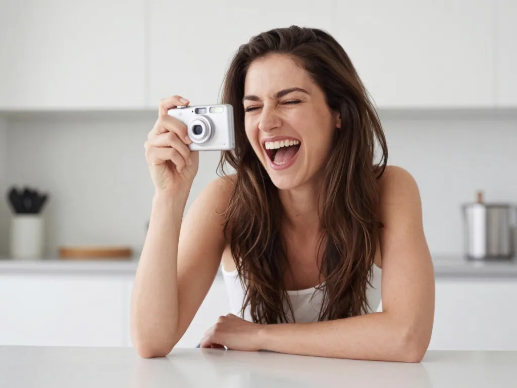
The left is what "a beautiful woman smiling at the camera" produces: symmetrical, poreless, lit from nowhere. The right asks for a bad moment and a cheap camera, and stops looking like a stock photo.
A woman mid-laugh at a kitchen table, eyes half closed, hair falling across her face, flash from a compact camera
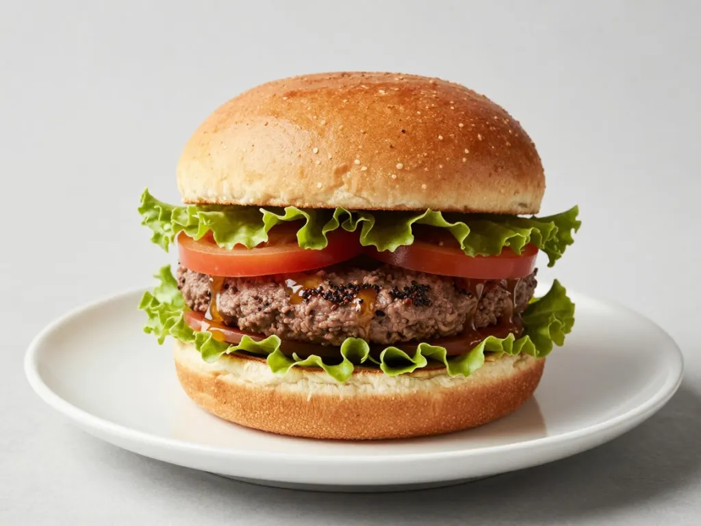
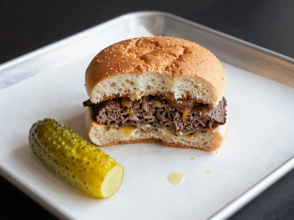
Food is where the effect is strongest, because the default is advertising. Naming the half-eaten state and the grease does more than any lighting term would.
A burger halfway eaten on a paper-lined tray, grease spots, a bitten pickle beside it, canteen lighting
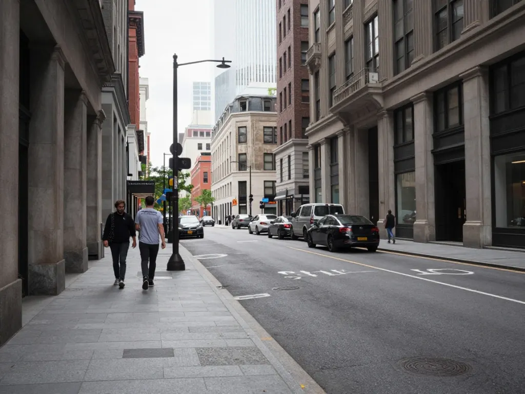
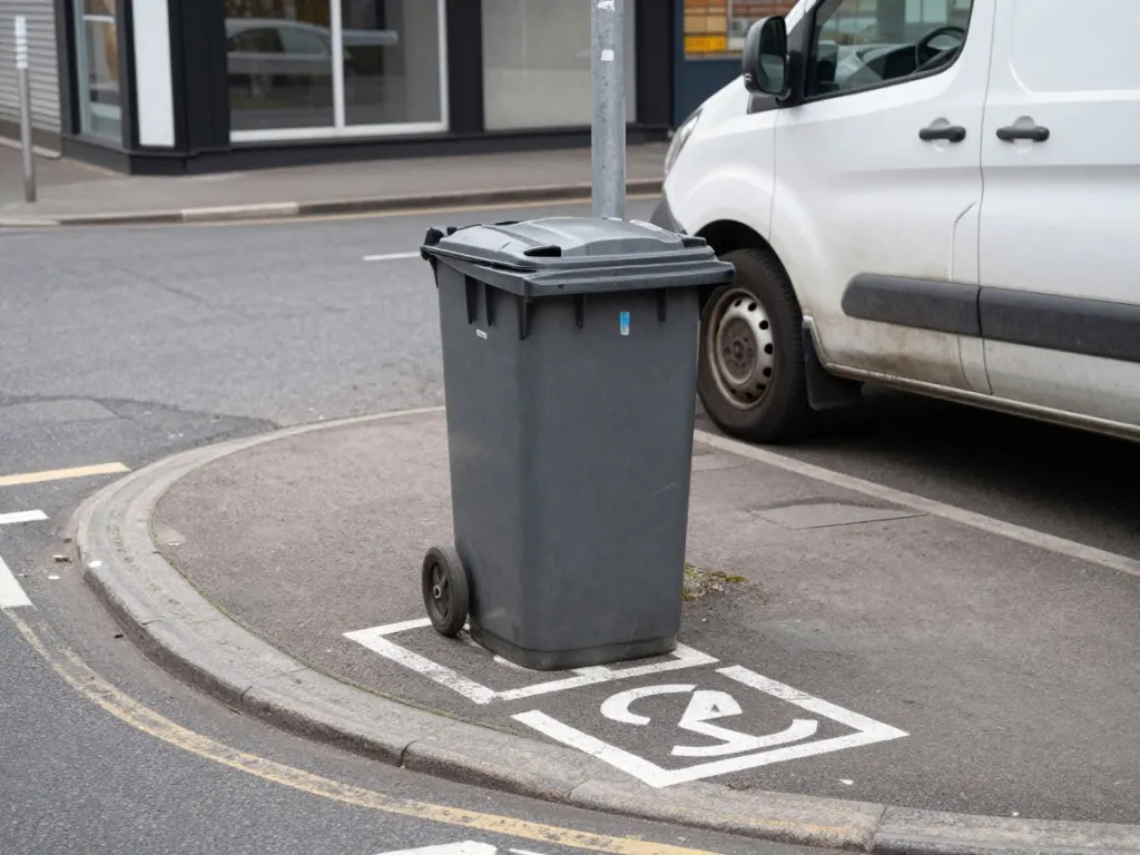
A wheelie bin is worth more than a lens specification. Note the road markings, though: the paint says nothing, which is the tell that survives everything.
A pavement outside a corner shop, wheelie bin, faded road markings, a parked van with a dent, flat grey daylight
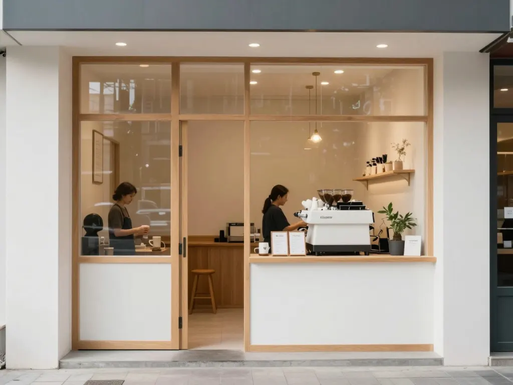
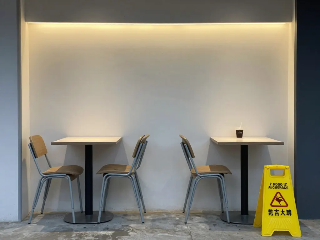
The strip lighting and the wet floor sign arrived. The stacked chairs did not: they are tucked under the tables instead. Specific arrangements are still much weaker than specific objects.
A small coffee shop at closing time, chairs stacked on two tables, wet floor sign, strip lighting
Three things that make a picture read as synthetic
Light with no source. Look at the left-hand portrait. Where is that light coming from? Nowhere in particular, evenly, from slightly in front. Real photographs have a light that is somewhere, and everything in the frame agrees about where.
Symmetry and perfection. Even features, even skin, a burger with every leaf of lettuce arranged. Real faces are asymmetric and real food has been touched.
Surfaces with no history. No scuffs, no dents, no fading, no dirt. This is the one people notice last and it is the one that does most of the work.
None of these is a rendering fault. They are the average of the training data doing what averages do, and the average photograph on the internet is an advertisement.
What to write instead
Three substitutions cover most of it.
Name a camera that is not good. "Flash from a compact camera" beat any amount of lens terminology in our set. A phone, a disposable, a security camera, a webcam. Each carries a whole set of defects that arrive together.
Name a light that is not flattering. Overcast, strip lighting, a single overhead bulb, low winter sun straight into the lens. Bad light is specific light, and specific light has a direction.
Name one piece of mess. A wheelie bin. Grease spots. A dent. A cable. This is the highest-value word in the whole prompt and it is usually the shortest.
What does not help is the adjective pile: "photorealistic, ultra detailed, 8k, hyperrealistic". We measured that separately in one word versus a rewrite, and quality words move the image far less than a single condition does.
The trade you are making
The right-hand images are worse photographs by any conventional standard. The burger is unappetising. The street is drab. The portrait catches someone with their eyes shut.
That is the point. What makes them read as real is precisely that nobody would have chosen them, and a picture that looks chosen looks made.
Which means this technique is wrong for a lot of jobs. If you are making a hero image for a product page you want the clean version, and the clean version is what you get by default. Reach for the mess when the picture is supposed to be documentary, or when it is going somewhere people are primed to be suspicious.
Ad
The one that did not work
We asked for chairs stacked on tables at closing time and got chairs tucked under tables. The strip lighting and the wet floor sign both arrived, so the prompt was being read.
The pattern matches something we found in the first-image walkthrough: named objects are reliable, named arrangements of those objects are not. "A wet floor sign" is a thing the model has seen labelled thousands of times. "Chairs stacked on tables" is a spatial relationship, and relationships are where diffusion is weakest.
So bias your mess towards nouns. Put the bin in the frame rather than describing where the bin is.
What no prompt will fix
Look at the road markings in the street pair. The paint on the tarmac is shaped like letters and says nothing, and no amount of prompting changes that, because small secondary text is the failure that has outlived all the others. We tested six of the classic tells and that is the one still standing.
If your scene has to contain readable signage, generate it without the text and add the type yourself.
And if you are chasing realism for something that matters, generate several. Ours is free and uncapped, so running the same messy prompt five times and keeping the least composed result is a legitimate technique rather than a workaround.
Generate the drab version
This is the street prompt from the third pair. Run it, then try it without the bin and the dent, and see which one you believe.
Name a mediocre camera, a specific unflattering light and one piece of mess. "Flash from a compact camera", "overcast", "a dented van" each do more than a list of quality adjectives. The results look worse, which is why they read as photographs.
Why do AI images look fake even when they are sharp?
Because they are too clean rather than badly rendered. Light with no identifiable source, faces and objects that are too symmetrical, and surfaces with no wear on them. Real photographs are full of history and accident, and the default output has neither.
Do words like photorealistic and 8k help?
Very little. They appear as captions across every kind of image, so they do not push the result anywhere in particular. A single condition the model can picture moves the image much further, which we measured across a separate set of twelve images.
Why did my prompt for a specific arrangement get ignored?
Named objects work far better than named relationships between objects. We asked for chairs stacked on tables and got chairs tucked under them, while the wet floor sign in the same prompt arrived exactly as requested. Put the object in the frame rather than describing its position.